Smart blocks are interactive blocks that are available in the Melablocks module for the RezMela Composer.

Smart blocks are all interactive. While you’re signed into the Composer, you can control the appearance of each block by clicking the “hamburger” icon (three horizontal lines) on the top right of each face.
The hamburger icons are only available while you are signed into the Composer. When you sign out, they disappear, leaving the scene looking more attractive – but you won’t be able to click the icons without signing in.
Let’s look at each type of Smart block in turn, and discuss how to use it.
Colorable block
This is a block that you can color in any one of a variety of available hues.
When first created, Colorable blocks are white in color:

You can change the color by clicking the “hamburger” icon to get this menu:

Select the color you wish, and the block will change:

The hamburger icon disappears when you sign out of the Composer, leaving the block a solid color:

To interact with the block again, you need to sign back into the Composer.
Here’s an example of using Colorable blocks with various colors to create an image:

Image block
This is a block that you can texture using any texture in your inventory.
When first created, the Image block is blank except for the “hamburger” icon.

Clicking the hamburger gives you this dialog:

What needs to be entered here is the UUID of the texture. The UUID is a unique identifier for that texture, and can be obtained by right-clicking the texture in your inventory and selecting “Copy Asset UUID” from the menu, like this:

The UUID is now in your clipboard, and can be pasted into the rectangular box by clicking in the box and hitting Ctrl+V (Command+V on a Mac) or by right-clicking in the box and selecting “Paste”.

Click “Submit” and the texture is displayed:

The hamburger icon is only there while you are signed in to the Composer. When you sign out, the icon disappears leaving just the texture:

To change the texture, sign back into the Composer and repeat the process.
Text block
This is a block that has text on each side. You can specify your own text, as well as effects such as colours.
Here’s what it looks like when first created. The text “AaBbCc” is applied by default.

As with other Smart blocks, a “hamburger” icon on the top right of each side gives you a menu when clicked:
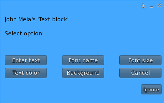
Let’s look at each of these options.
Enter text
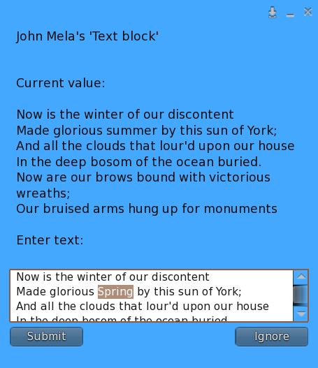
This option lets you change the text that is displayed.
When you select this option, you will see this input box:

Click in the white rectangle and enter the text you want to display. You can use the Enter key to put text onto a new line if you wish:

When you’ve entered the text, click “Submit” and it will be displayed:

The Text block will resize the text if necessary to fit it in:

Note that there is a maximum of 255 characters (which is why the Shakespeare quote in the last image finishes in the middle).
When you change the text, any previous text you have entered is shown above the white box:

This is so that you can copy and paste the text, making changes if necessary.
Some older browsers will not allow this text to be selected for copying. For this reason, the same text is also printed in Nearby Chat, where you can copy it from the Chat window:

For this example, we’re assuming you can copy it from the blue text box.
To copy the existing text, select it with the mouse:

You can then right-click the selected text and choose “Copy” from the menu:

Then right-click inside the white rectangle and select “Paste”:

This will paste the text into the text box, where you can edit it using standard text editing methods:
Font name
There are three available fonts: Noto Sans, Noto Serif and Architect’s Daughter:

The default font is Noto Sans. This is what the three look like when applied:

Font size
You can select from a variety of font sizes, or “Auto” to have the Text block calculate the best font size for the text you have entered:

The default is “Auto”. Here is an illustration of several different font sizes:

The “Auto” option finds the largest font size that will fit the given text into the available space, including hundreds of font sizes not available in the menu, so usually it’s best to leave it at that. However, you may want to override that setting in certain cases – for example, if you have several Text blocks showing different text, and you want the font sizes to match across the different blocks for consistency.
Text color
This menu provides you with a choice of colors for your text:

Here’s an example of some text with black (default), red and blue colors:

Background
This menu gives you a choice of background colors:

Here are some examples of combinations of text colors and background colors:

And here is an example of text color and background color being used to make a Text block blend with its surroundings:

One of the options is not a color: “Transparent”. This gives you a completely transparent background, which can be useful to overlay other objects with text. For example, this wall of metal blocks has a Text block, with a transparent background, positioned just in front of it (carefully placed using the Nudge tool):

Web image block
This is a block on which you can apply textures by specifying a web URL.

Like other Smart blocks, the Web image block has a “hamburger” icon on each side, which you can click to change the block – in this case to specify the URL of an image:

Click in the white rectangle and paste in your URL:

Then click “Submit” and the image will be displayed:

When you sign out of the Composer, the hamburger will disappear until you sign in again, leaving a clean image on each side of the block:

Light block
This is a block that acts as a source of light. You can control the amount of light and its color.
To be able to view the lighting most clearly, we’ll look at this example with the sun position set to midnight.
Here’s a simple demo scene to test our light. This uses the “Asphalt” and “Stone wall 1” blocks from the Building category, and the “Text block” from the Smart blocks category.
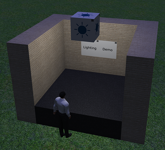
In this image, the user is signed in to the Composer, so the Light block is visible (as are the hamburger menus on the “Text blocks”). When the user signs out, the Light block disappears, but the light it emits is still there, casting light on the walls, floor, avatar, etc.

Now let’s see what we can do to modify that light. If we sign in again, the Light block reappears, and we can click on the “hamburger” on the top right of any side of the block, seen circled in red here:

When you click the hamburger, you will see this menu at the top right of your screen:
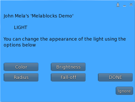
This shows the four types of adjustment you can make to the appearance of the light: Color, Brightness, Radius, and Fall-off. The “DONE” option just closes the menu.
Note that to save load on the system, if you don’t click any options on the menu it will time out after five minutes. You will see “Menu timed out” in local chat, and you will need to click the hamburger again to get a new menu.
Each of the four different types of adjustment gives you another menu which lets you select the value. Let’s look at “Color” first.
Color
When you select “Color” from the main menu, you will see this sub-menu, listing the available colors:

The default color is White.
Select any one of the colors, and the light will change to that color. Here is the same scene with different colors to illustrate the effect:

Brightness
This option gives you the following values for Brightness:

The default Brightness is 50%.
Here’s what the same scene looks like with 10% brightness and with 100%:

Radius
The Radius of the light is the distance the light will go from the source. Here are the options in the Radius menu:

The default is 5m.
As the light travels from the light source outwards in all directions, it will fade gradually (see Fall-off below), disappearing completely by the time is has travelled the distance specified by the Radius.
Here is an illustration of the same scene with the light radius set to 5m and to 20m:

Fall-off
The Fall-off value specifies how rapidly the light fades as it travels towards the Radius (see above). These are the available values:

The default is 1%.
This illustration shows different values for Fall-off and their effect on the scene:

In practice, the best way to achieve the effect you want is to add lighting near the end, when the scene is more or less complete, then experiment with all these parameters until you find the ones that suit your needs.
You must be logged in to post a comment.